Hi friends! Today I’m excited to share a client project we just installed. We worked on a wall in her office space, the wall behind her desk, that is primarily seen when she’s in video with clients or on social media.
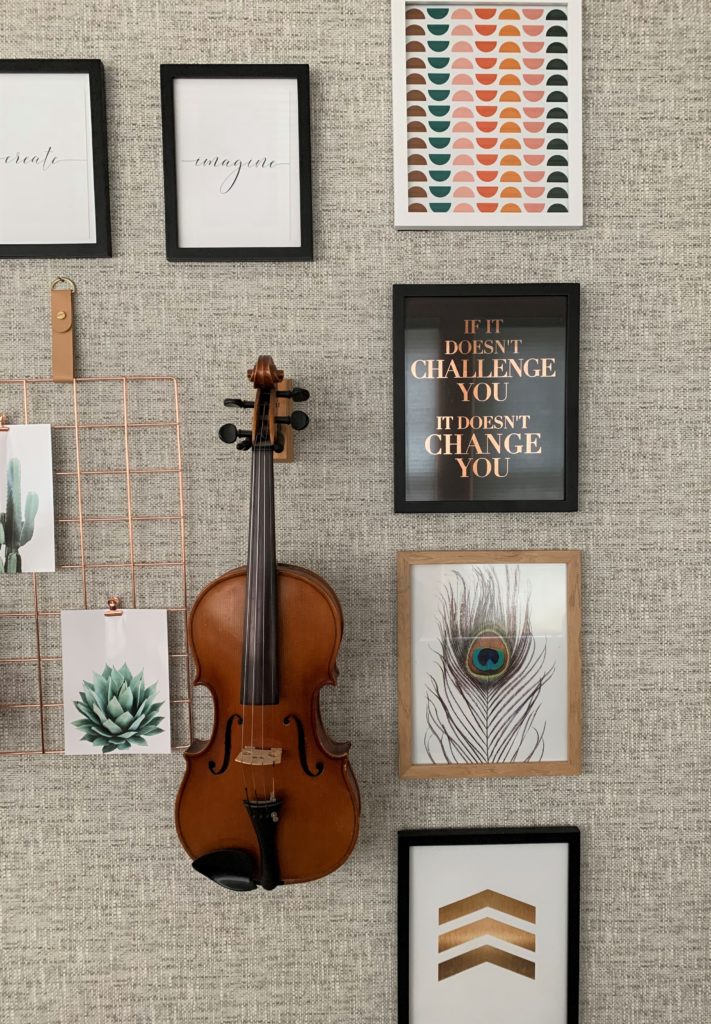
This was a great experience and totally worth the money. Because this was eDesign, it was more approachable because of the design cost. My design needs are not grande. I simply want a great design plan and a shopping list. This was perfect and something I will do again in another room down the line.
-Client
Client profile:
When the client came to me, she told me she wanted the wall behind her desk to match her brand more closely. It was certainly a unique request, but I was excited for the challenge. I sent her my online questionnaire and she added her favorites styles, room measurements and other specifications. She had also sent me some screenshots of other individuals whose background on video calls matched their personalities and brands really well. Next up, was a consultation via Zoom conference call.
Consultation:
On the call, we talked about why each of the backgrounds appealed to her and I showed her a few other inspiration images of office spaces to get her reaction – this was hugely telling because I learned important details about her style preferences, such as she didn’t want too much white in the space, and that she was open to wallpaper. Once I had the ok to add wallpaper and that gray was a good color option, I had a much better idea of the direction I wanted to take the space.
Two Idea Boards:
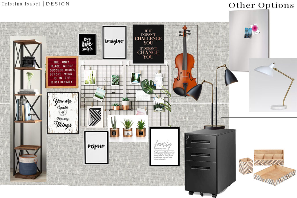
I always like to present two idea boards to clients so I can get a better idea of their style. Style is such a personal thing, even when we think we know what we want, we need to envision it and it helps us understand what we really want in a space.
The first Idea Board I called Modern Industrial. One of her favorite styles that she specified in the questionnaire was Industrial and one of her inspiration pictures had some industrial elements and black and white on it, so I took those ideas to add to this board. I also added a bookcase for a little nook area in her office, a violin she wanted to add that belonged to her grandfather and meant a lot to her and a mix of inspirational quotes as well as organic shapes like leaves. The wallpaper for this one was a textured linen look and it was an inexpensive peel and stick wallpaper.
Modern Industrial Idea Board
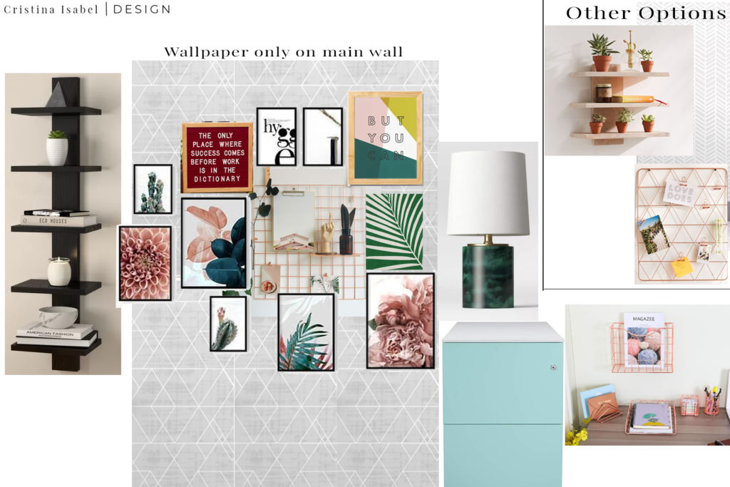
For the second idea, which I called Modern Eclectic, I incorporated more color and lighter features. She had said her favorite colors were evergreen and merlot, so I played with those and shades of blush and green. I also added Rose gold elements throughout and a modern floating shelf instead of a standing bookshelf. She had also wanted a file cabinet and I suggested this pretty blue one to light the space.
Modern Eclectic Idea Board
Final Design:
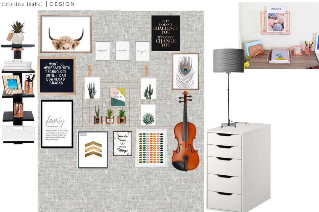
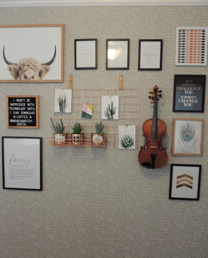
The client reviewed the designs and she loved elements from both. She added feedback through my client dashboard and I got to work on an updated design. Then we went back and forth a few times on getting the images for the gallery wall just right. We ended up with a mix of both designs, mostly black and white but with elements of rose gold and we added a white cabinet for storage to pick up on the white elements from the design. We kept some of the color but toned it down a bit for a mostly neutral look and went with the gray textured linen wallpaper.
Final Design for Client
Shopping Links:
The great thing about online interior design is that it gives my clients the autonomy to set up their room themselves on their own time. Once we finalized the design, my client immediately purchased all the art and furniture. Since the client lives locally, we set up a time for the install and I had sent her instructions for setting up the art prints in the right sized frames so we would be ready to go on the day of the install.
Normally, once the shopping links are sent, a project is done. I offer 4 weeks of client support after a project for any questions but otherwise, clients can purchase on their own time. Although I highly suggest they purchase at least the main pieces as soon as possible to keep the momentum of the project excitement going which will help them start seeing their space change and will keep them energized to finish the project.
For local clients (located in the DMV – DC, Maryland, Virginia area, I offer in-person installation packages as well) which the client was interested in. For clients that are not local, I also offer virtual assistance for questions with set up.
“This would never have been done if it wasn’t for you”
-Client
In-Person Installation:
The client and I met on the morning on January 10th to install her space. We started with wallpaper as it was the background for the gallery wall. Pro Tip: When installing wallpaper, instead of trying to match the edges of the wall exactly, a pro tip is to overlap by an inch or inch and a half while sticking it on and then go back and use a razor blade or box cutter to cut straight along the edge with a ruler guiding you. Also, I hugely recommend getting the peel and stick wallpaper rather than traditional wallpaper which can be easily moved if you make a mistake and can easily be removed if you decide you no longer want wallpaper in a couple of years.
Wallpaper Installation in Progress
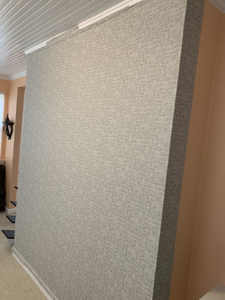
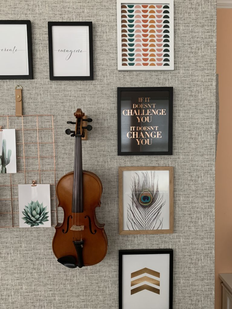
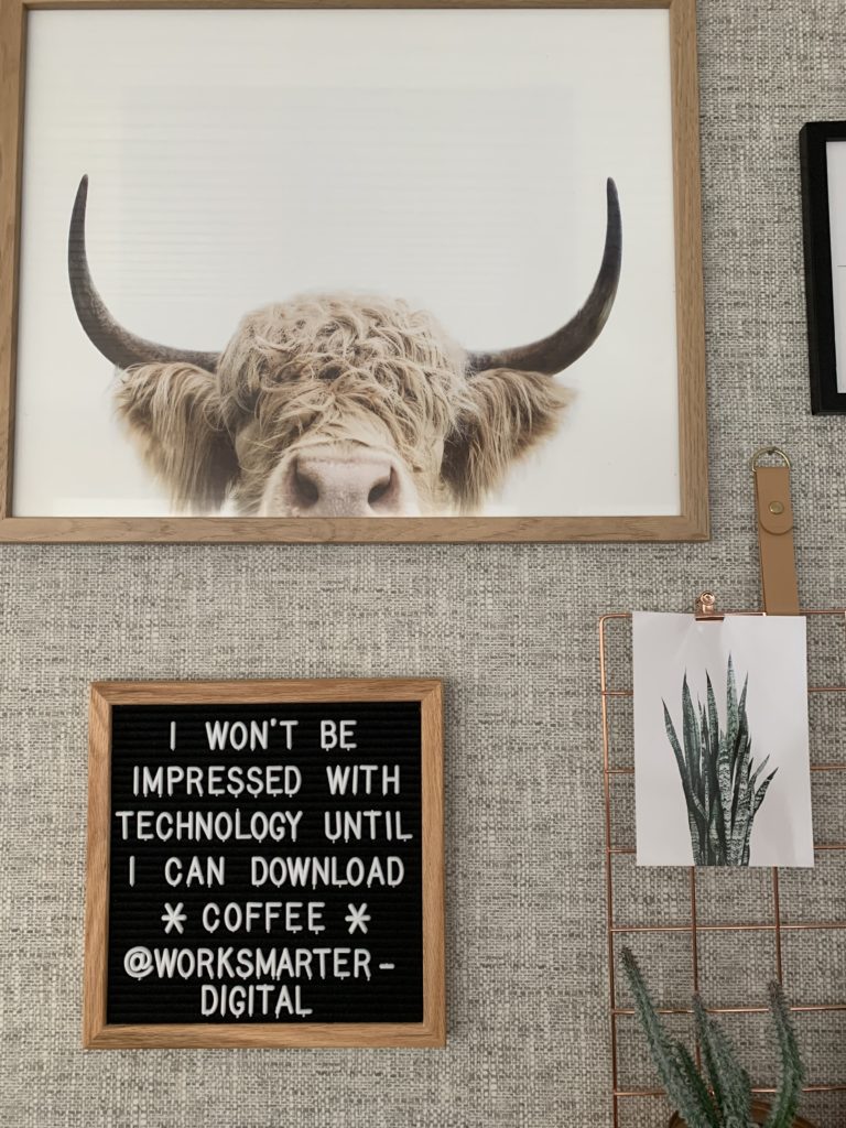
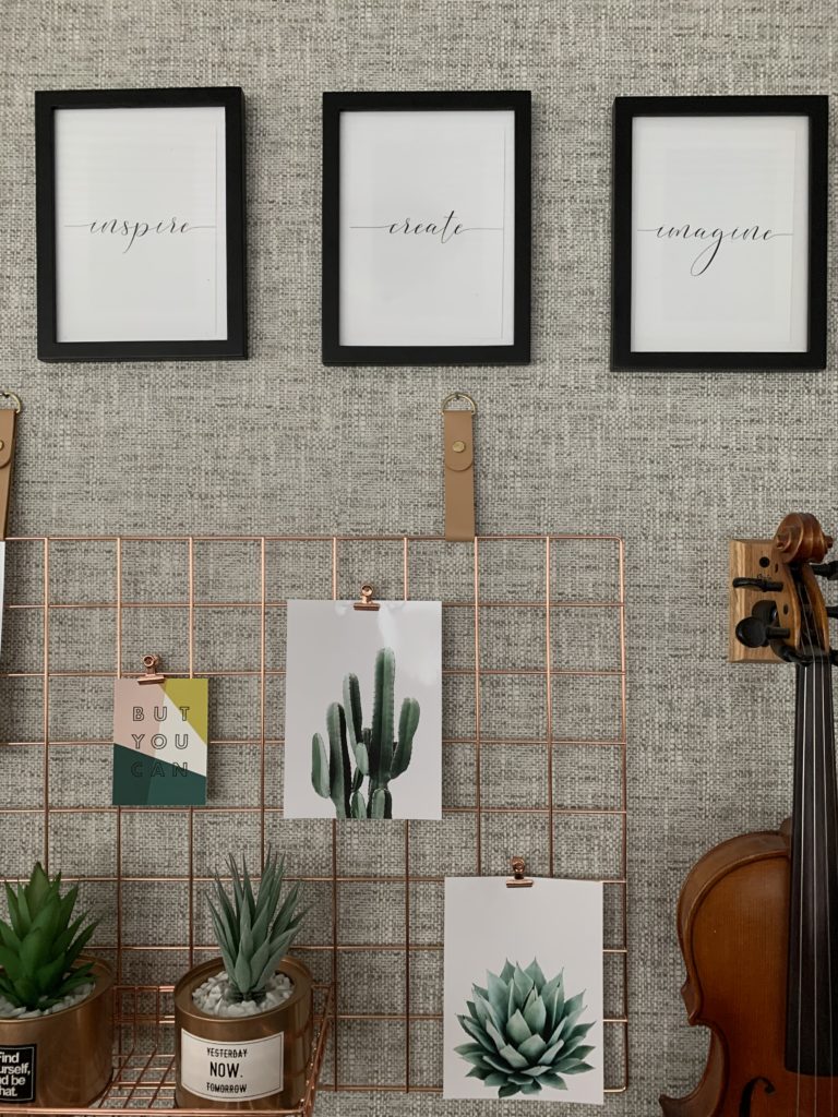
Next we worked on the gallery wall. We started with the rose gold grid in the middle which was the center of the gallery wall. It was really really to install, just need two nails. Then we worked on the frames.
Then we got out the power tools and hung the violin and the floating shelf. Anyone can do this, trust me! Remember YouTube is your friend!
Finally, we styled the shelf and we were done. (Note, the client originally wanted to wallpaper only the 6 foot wall that juts out behind her desk but will be adding more wallpaper for the reminder of the wall.)
Full Gallery Wall
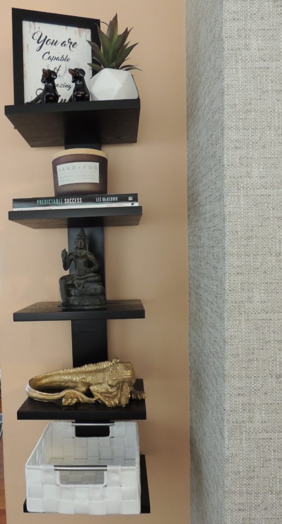
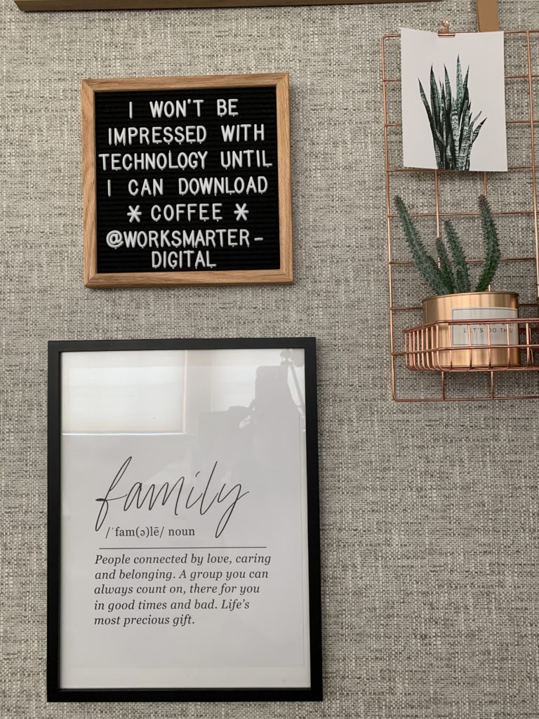
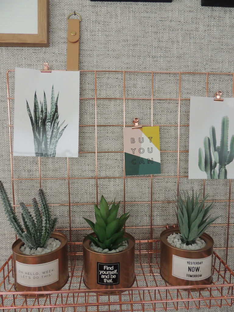
Interested in updating your office space to better match your brand or to make it a more comfortable and inspiration space? Let’s work together to make it happen. Have questions? Email me at hello@cristinaisabeldesign.com.
[…] wall 100% makes it one of my favorite spots in the room. It’s functional and beautiful. The gallery wall is my fave, it has photos from our honeymoon and our trip to Japan and I look at it all the time […]
[…] 10 Gallery Wall Designs […]