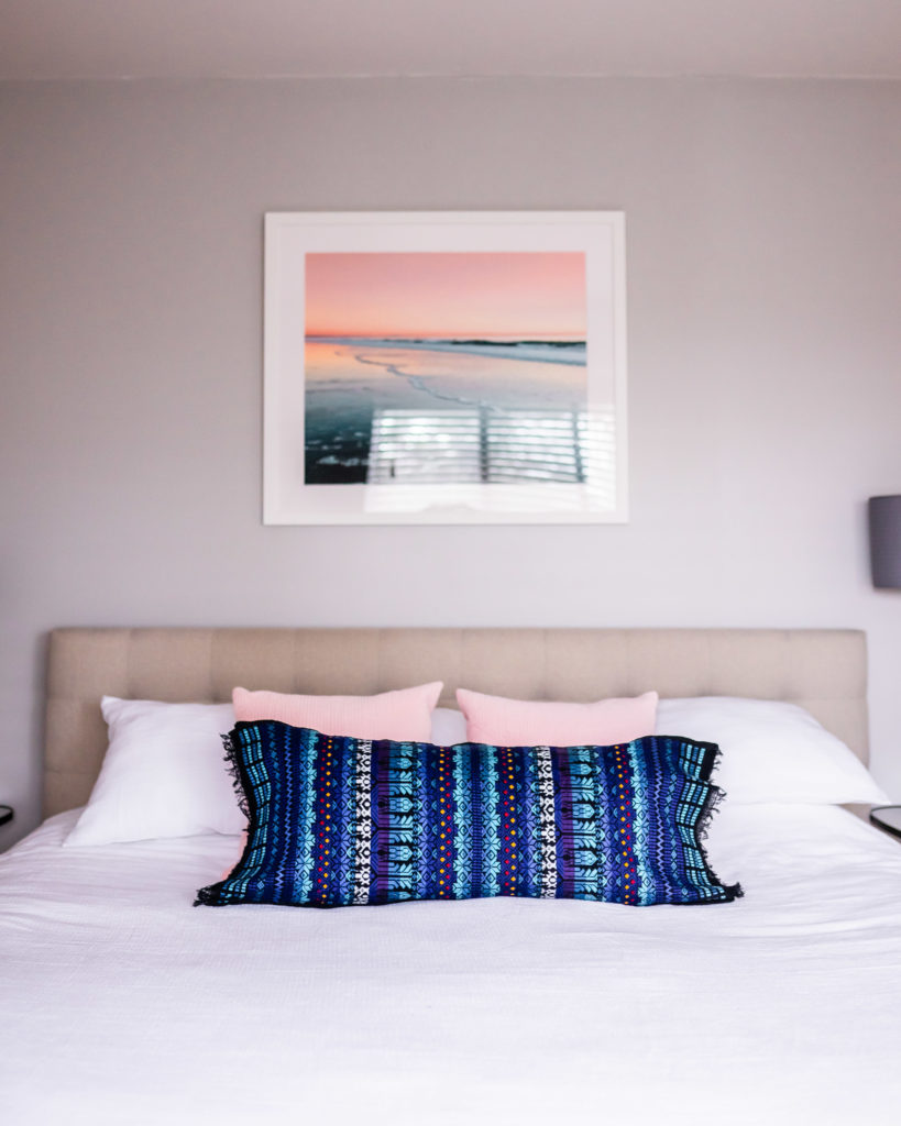
Hello friends! Ta da! Here is the master bedroom room reveal. It was so much fun asking you to vote on which room reveal you wanted to see first since I couldn’t decide.
We’ve been loving adding some color to the house slowly but this room is mostly neutral with warm wood tones and small pops of color with blush and navy, the combination feels very cozy and serene and we love it.
The Journey
The first thing we did in this room when before we moved in is paint it this warm gray. Then it look us about 2 years to put the rest of it together. Below I share the details – I divided the sections by each wall in the room since it’s a large-ish room and that’s how it envisioned it in my head.
The Bed
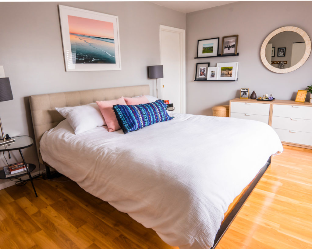
I had this bed and 3 nearly identical beds on a wishlist on All Modern before I bought it. I’ve learned throughout the process of furnishing my home that you just have to trust your instinct. If you have an idea that something will look good, go with it, there’s a reason you feel that way.
Getting this bed was the BIGGEST life changer when it came to the cozy feeling we have now in our room. I LOVE it still to this day. The underside of the bed is a wood with industrial metal legs and the headboard is a nice creamy linen, I love the combination. I was initially going to go with the version of the bed that had a gray headboard but I’m so happy I went with this light beige/ivory tone because it warms up the room and then the rest of the room came together with some similar tones.
Ok so back to trusting your gut, I actually used an e-design service for this room (before my designer days). I was stuck on several elements of this room and hadn’t moved forward after two years in the house. Using e-design was the BEST decision. It helped me realize that what I had in mind for the space was the right call and it also pushed me into to do things I wouldn’t have thought of but that I was very happy with. But I also realized that my gut was spot on when it came to certain elements in the room, such as the long mirror and art on this wall, the hooks by the closet and the bench in the window area. Sometimes having a design eye is really helpful, especially a third party who can look at the space objectively and make a good call. So if you like me are stuck somewhere with a home décor project, let’s talk, I can help!
The Long Wall
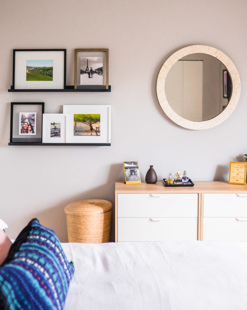
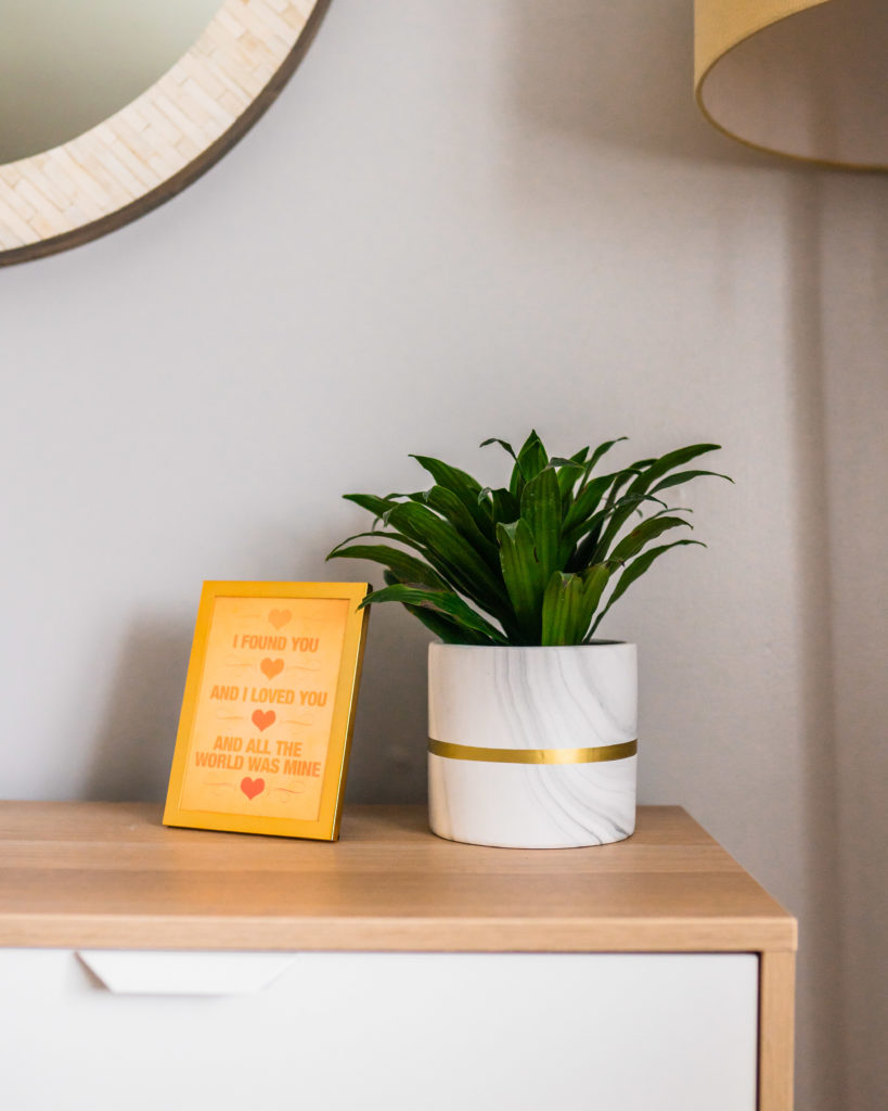
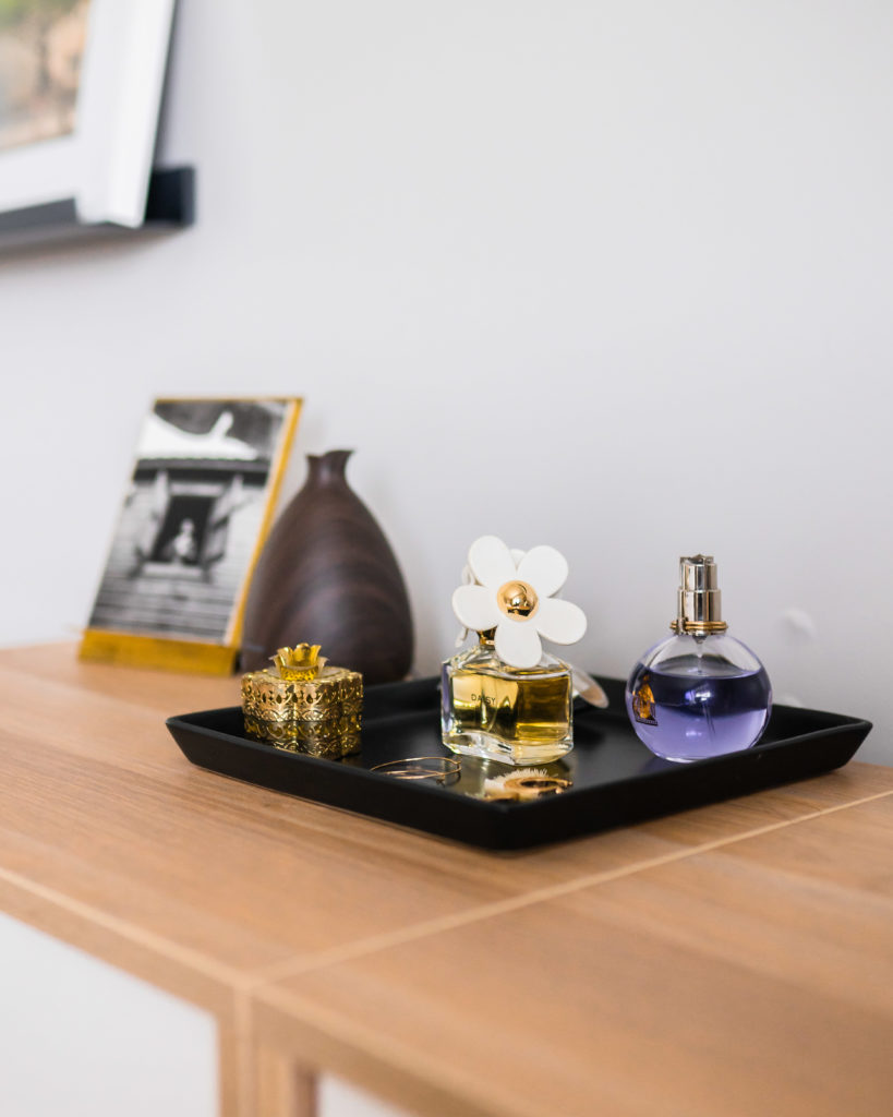
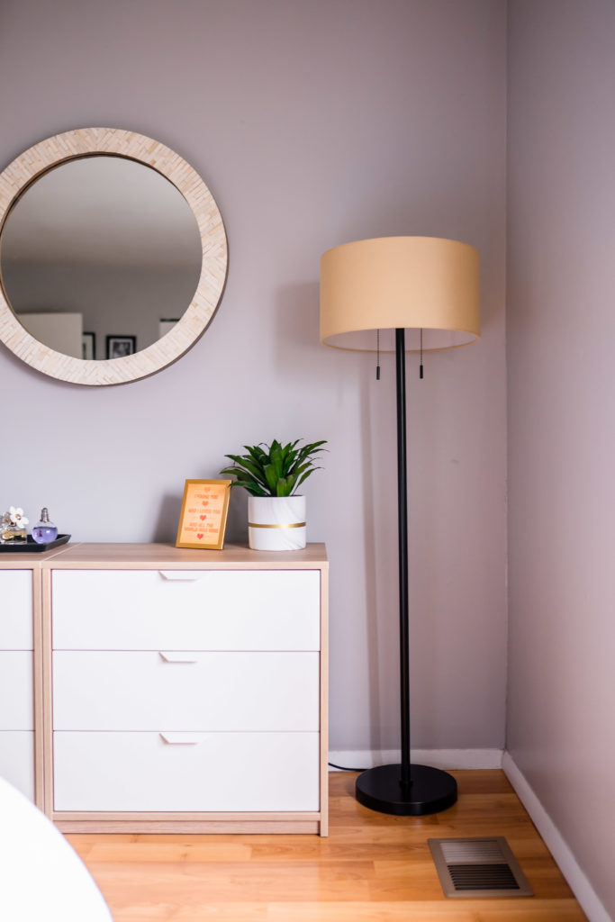
This wall was the reason that I was stuck. It needed to have several functions including a dresser, a mirror, a lamp for additional lighting and a hamper. We don’t have space for hampers in our closet so we needed ones that were attractive enough to keep out in the open. The designer suggested this hamper which was over $100, normally I wouldn’t spend that much on a hamper BUT for years I had cheap ugly hampers and it drove me crazy. So I love these hampers, I have two of them next to each other, they are handmade and made in Mexico. They are pretty sturdy but we actually take out the clothes from these and use regular plastic hampers to transport up and down the stairs to help keep them looking good. Now, I would absolutely recommend splurging on a hamper… sometimes it’s important to spend a bit more for long term happiness (and honestly $100 is not much more than $30 in the long run).
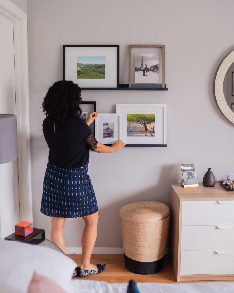
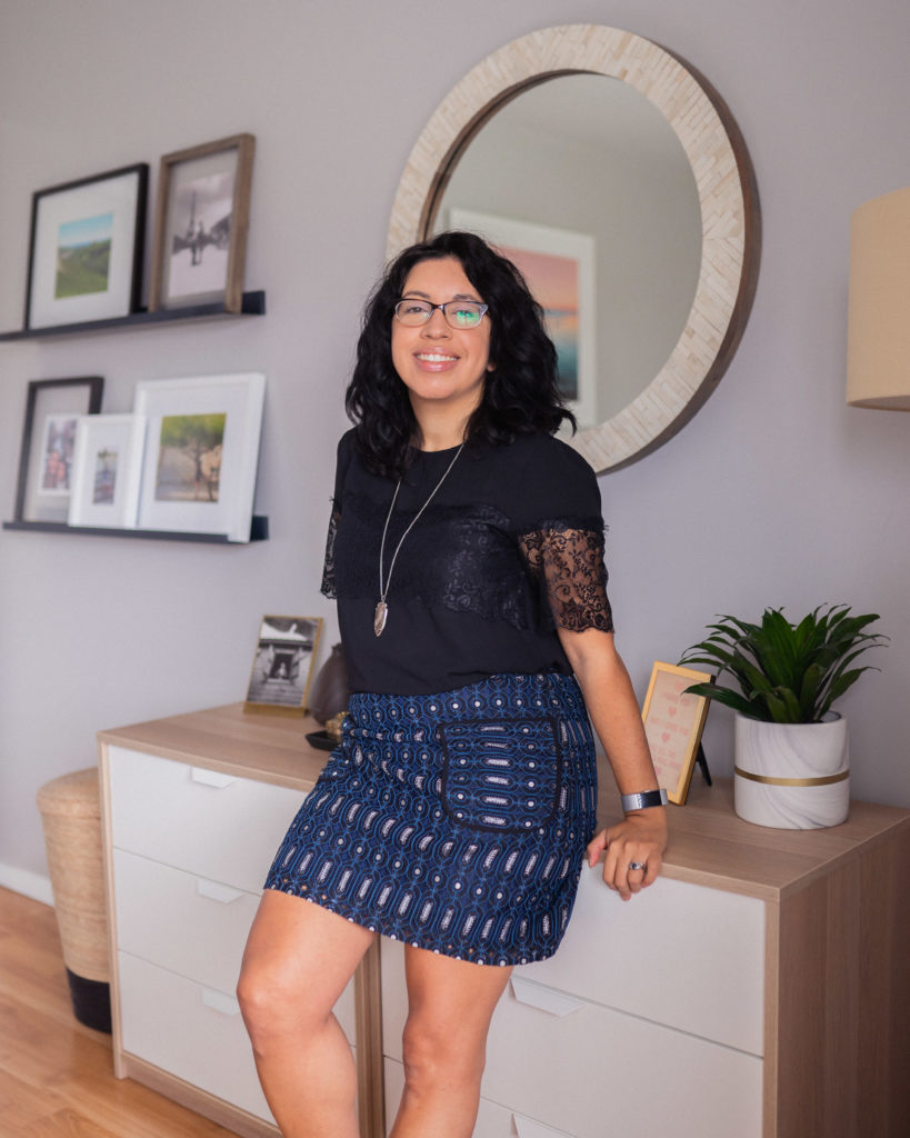
Getting this layout for this wall 100% makes it one of my favorite spots in the room. It’s functional and beautiful. The gallery wall is my fave, it has photos from our honeymoon and our trip to Japan and I look at it all the time with a smile on my face.
I have a combination of high and low budget items on here, for example, the dressers are from IKEA. I looked for a while at dressers in a light color but didn’t find anything that wasn’t overly costly, so these two petite dressers were perfect. Plus a few years ago, we became very minimalist about our clothes, so this dresser keeps me in check with only storing what fits here and in my closet which I share with my husband. If new items come in, something has to go out, that’s been our mantra for about 6 years and it works great.
The gallery wall shelves are from Crate and Barrel and the frames are from Pottery Barn and Artifact Uprising. I will link to all the sources on my Get the Look post next week!
Wall across the bed
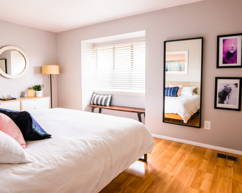
Ok so the wall across the bed has a window nook and then about 6 feet on the right. I always imagined having a bench there and didn’t realize that a 6 foot bench literally fits perfectly in the spot and best of all, our dog beds are under there, giving our mini-schnauzers a cave-like spot to sleep. For the wall next to the bench, I love how this long mirror turned out with this cool art we got in Savannah, GA at a little art gallery. It will always remind me of Savannah and of the cool artist prints we found in that shop.
Closet wall
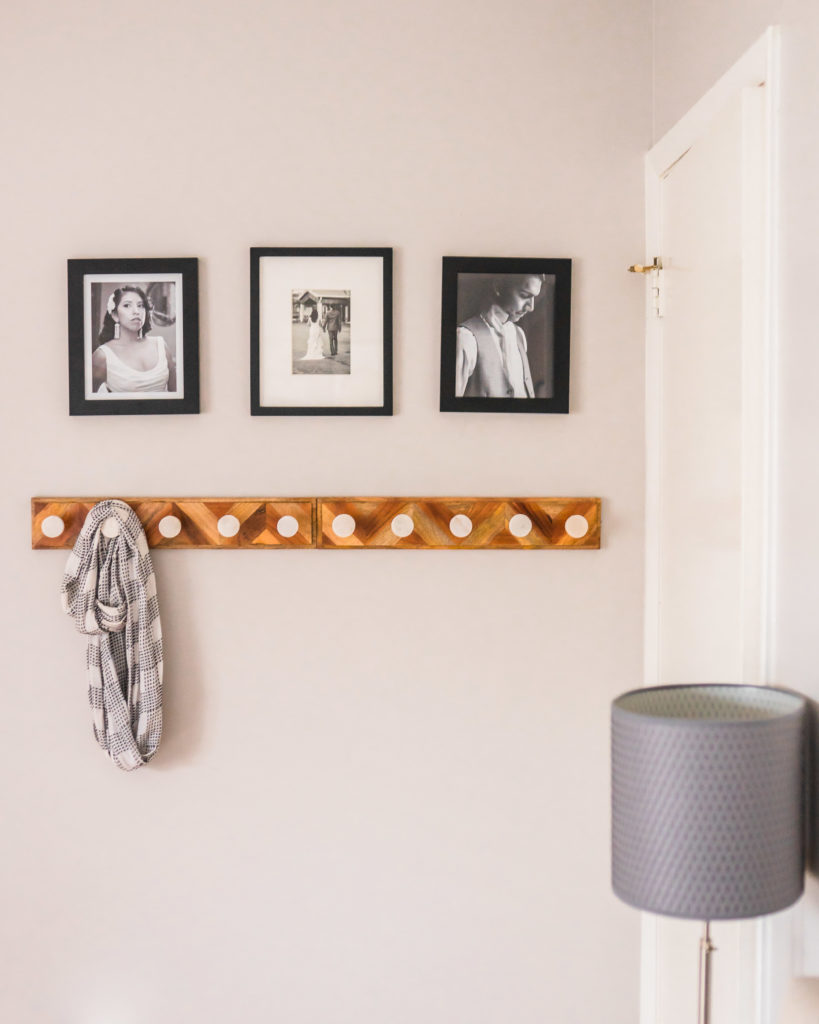
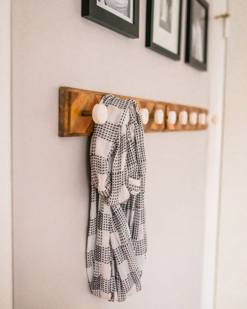
There’s another 6 foot spot next to the closet and I knew hooks would be so helpful in that corner of the room. It took me a while to find just the right hooks (am I the only one who obsesses over these details LOL) and I found these lovely ones from World Market. Then I put the pictures from our wedding and it became the perfect little corner.
So that’s our little master bedroom. It’s cozy, it’s comfy, we spent LOTS of time in there recently with our new baby and it is our happy little place to rest. Stay tuned to a post next week with all sources and a Get the Look post!

Ready to create the master bedroom of your dreams? Let’s work together to make it happen. We can be done with the design in 1-2 weeks and you’ll be on your way to the retreat of your dreams! Have questions? Email me at hello@cristinaisabeldesign.com.
What a great article. I love your drawers. The white is to die for. I’m trying to get a fresh cabinet painting soon in my own place, and seeing your design was really helpful to me. Thanks for sharing!
[…] here. Then we worked on the dining room, parts of the entryway and sitting room, next their large master bedroom and finally their fantastic entertainer’s basement. Check out all the details in the video […]